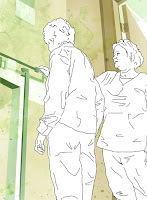
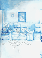
Here are the animations from past animation classes as well as my BFA show animation.
Monday, May 17, 2010
Portfolio Version 2010- Paintings from Italy
So I am updating my portfolio for this year, and for the first section, I'm featuring the paintings I made when I studied in Italy last summer. They are recreated from paintings and I saw visiting museums as well as other works from some of the artists' works there.
 This was the first piece, recreated from Filippo Lippi's work. I used an egg tempura painting style.
 The next painting was recreated from Simone Martini's Annunciation and Two Saints. It was created with egg tempura and gold leaf.
 The next painting was another annunciation piece recreated from Botticelli's work, done with tempura grassa.
 Created similarly to the previous work, this piece is based off a Botticelli work incorporating my pets. It's still a work in progress, but it incorporates the process of egg tempura.
 This was the first piece, recreated from Filippo Lippi's work. I used an egg tempura painting style.
 The next painting was recreated from Simone Martini's Annunciation and Two Saints. It was created with egg tempura and gold leaf.
 The next painting was another annunciation piece recreated from Botticelli's work, done with tempura grassa.
 Created similarly to the previous work, this piece is based off a Botticelli work incorporating my pets. It's still a work in progress, but it incorporates the process of egg tempura.
Tuesday, April 21, 2009
Artist Lecture- Katy Schneider
 Katy Schneider visited a while back, and I wanted to make an entry about her lecture. She began by simply showing her work, and I wrote a few notes of what stood out to me before she began speaking. Her work in general tended to keep the texture of the paint, but it still managed to have a lot of detail. A lot of her work really captures scenes of life and the figure. Some appeared more like family photographs, with several of the figures looking straight at the viewer. There also seemed to be a large focus on children and motherhood. Her flower images also were often very centered.
When describing her work, she mentioned a few things that stood out to me. She said that her work feels more meaningful when smaller, and her goal was how to create meaning using a small space. This related to how she grew up in an apartment with a large family. She also felt she had more of a story to tell when she became a mother. She also mentioned that she preferred her work to be a focus on the everyday rather than just happy families, and she did this through various lighting techniques. Her work overall has nice contrast and color, and it was interesting how she worked with the concept of family without it becoming too cliche.
Tuesday, March 24, 2009
Subscribe to:
Comments (Atom)


